A forex chart is a visual representation of how prices have moved in the past. Traders study the charts & try to predict how prices will move in the present.
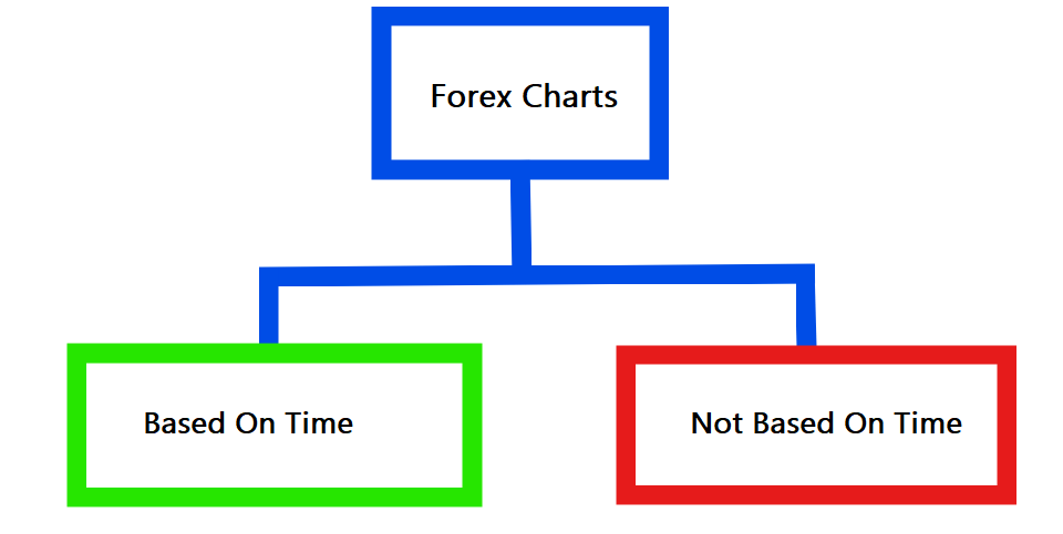
While the most popular forex charts are based on the time variable, there are charts that don’t depend on time.
On time-based charts, bars form after your selected time interval irrespective of whether the price of the currency pair has moved considerably or not; & this creates more noise on these charts with some bars being meaningless.
However, on charts that are not time-based, bars will only form when a set of criteria is met (you will specify these criteria). This creates less noise on the charts because except if these criteria are met, the bars will not form.
We will discuss the most popular forex charts.
| 🕰️Based on time | Not based on time |
|---|---|
| Candlestick chart | Tick chart |
| Line chart | Renko chart |
| Area chart | |
| Bar chart |
Candlestick Chart – Best Forex Chart
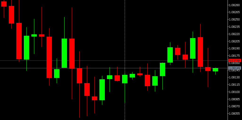
The Japanese candlestick charts are based on time, & are the most popular charts in forex trading, because they display lots of information in different timeframes.
Composition of a candlestick
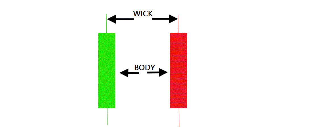
The Body: can be of any height and shows the distance that the price has travelled. A long body means a lot of transactions took place, and a short body means little transactions took place.
The Upper Wick: shows you the highest price fluctuation recorded during the timeframe.
The Lower Wick: shows you the lowest price fluctuation recorded during the timeframe being analyzed.
What are Timeframes on Candlestick Charts?
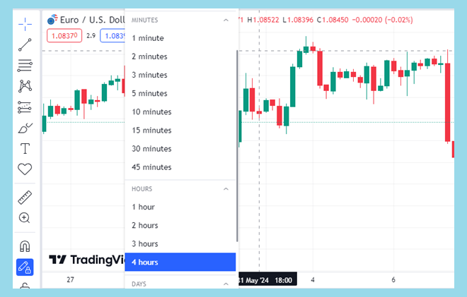
Because candlestick charts are time based, you must select the time interval at which new candles will form.
If you set the time interval to 5 minutes, then a new candle will form after every 5 minutes. This also means every candle will represent 5 minutes of price action.
Forex trading platforms today allow you to set candlestick time intervals from as low as 1 minute to as high as 1 month.
One advantage of smaller candlestick timeframes (such as 5 minutes) is that it makes the candles form faster & locating entry/exit points is easier.
However, one disadvantage of smaller candlestick timeframes is that there’s a lot of noise & meaningless candles formed.
The advantage of larger timeframes is that they let you see the overall market trend (birds eye view) but the disadvantage is that the candles will form slowly.
So, what candlestick timeframe should you use? You can use larger timeframes to check overall trend & smaller timeframes to time entry & exit.
What is a Bullish candle?
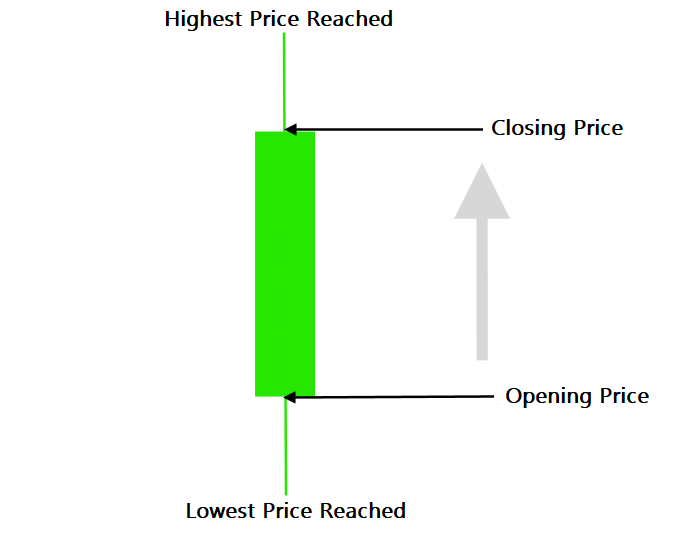
A Bullish candle forms when price is going up & is typically depicted in green color (most trading software allow you customize the color).
You read a Bullish candle from bottom to top so the opening price is at the bottom & the closing price is at the top of the candle.
On Bullish candles, the closing price is always higher than the opening price.
The lower wick shows you the lowest price during the timeframe you’re analyzing & the upper wick also shows you the highest price reached during the timeframe.
Let us interpret the price action for this 1 Day Bullish candle
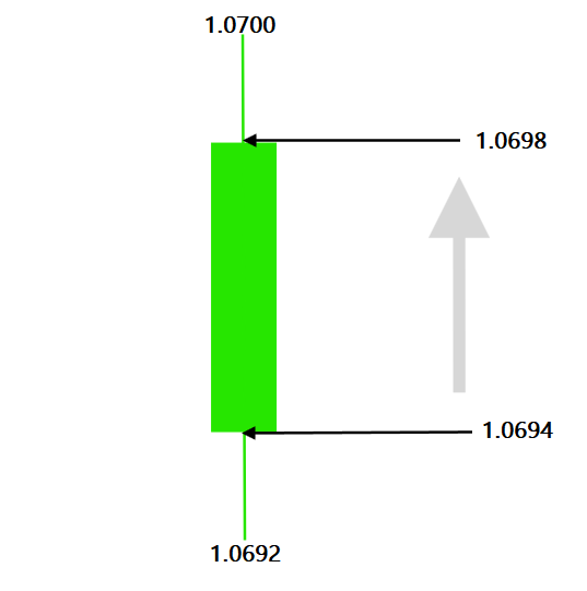
For the above candle, the price opened at 1.0694, fell as low as 1.0692, then rose as high as 1.0700; before finally closing at 1.0698.
The closing price is higher than the opening price which qualifies it as a Bullish candle.
What is a Bearish Candle?
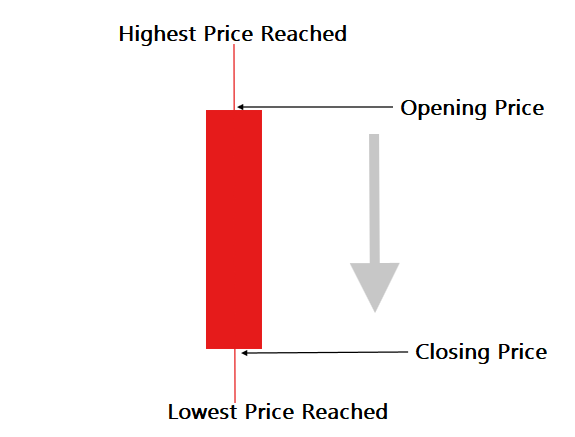
A Bearish candle is usually red in colour and signifies that price is falling, so the closing price is always lower than opening price.
You read a Bearish candle from top to bottom hence the opening price is at the top & the closing price is at the bottom of the candle.
The upper & lower wicks also show you the lowest/highest prices attained during the timeframe.
Pros & Cons of Candlestick Charts
👍 Pros
- Candlesticks give you lots of information on price action
- You know when the next candle is going to form because it is based on time
- The wicks make it easy to see volatility in the market
- Popularity: available on all trading platforms
- Most technical indicators work better with candlestick charts
- Has its own chart patterns unique to it
👎 Cons
- Takes up screen space so it’s difficult to overlay two charts & compare them without getting confused
- You get a lot of noise especially on smaller timeframes
Line Chart – Best for Drawing Resistance & Support Lines
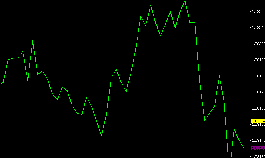
A line chart is a time-based chart that connects closing prices of a currency pair together in a zigzag line.
Every break in a line chart shows you the price action for your selected timeframe. If you are analyzing using the 5-minute timeframe, then every break on a line chart signifies the start of another 5 minute of price action.
On some trading platforms such as MetaTrader, hovering your cursor over a line chart will display a summary of OHLC prices.
Because the line chart doesn’t take up screen space, it is easy to compare different currency pairs for correlation, by overlaying their charts on each other.
Pros & Cons of Line Charts
👍 Pros
- Line charts are ideal for locating support & resistance zones
- Easy to overlay & compare several currency pairs while still maintaining a clutter-free screen.
- Popularity: available on most trading platforms
👎 Cons
- More difficult to analyze because all the lines are joined together
- Doesn’t visually display OHLC prices so it’s difficult to estimate volatility
Bar Chart – Best for Smaller Screen Devices
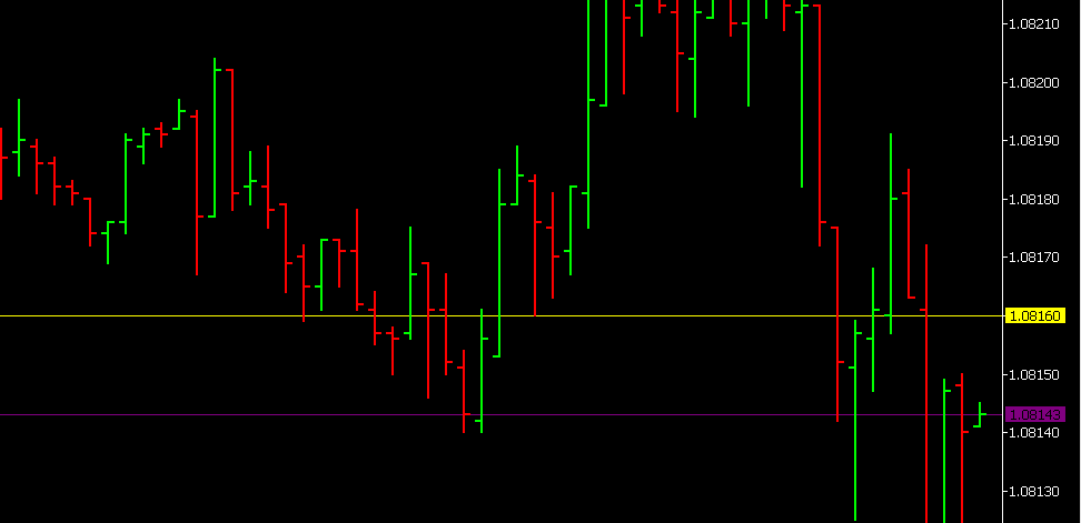
A bar chart is another time-based chart, so each bar forms after a specified timeframe/time interval.
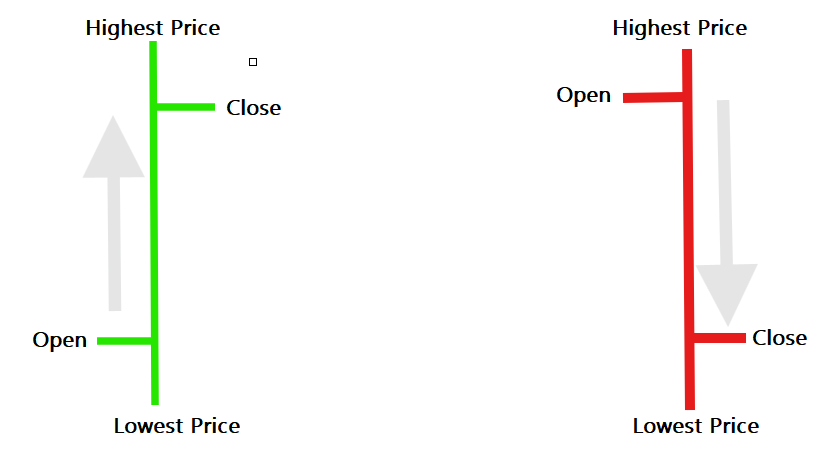
The green bar signifies rising prices & the red bar signifies falling prices
The branch to the left represents the opening price & the branch to the right represents the closing price.
For a green bar price opens at the bottom & closes at the top, & for a red bar price opens at the top & closes at the bottom.
The bottom of the bar represents the lowest price reached during the timeframe, & the top of the bar represents the highest price attained during the time.
Pros & Cons of Bar Charts
👍 Pros
- Shows OHLC prices which makes estimating market volatility easier
- Because the bars are slim, more data can be showed on the screen
- Popularity: available on most trading platforms
👎 Cons
- Not visually appealing
Area Chart – Best for Comparing Different Currency Pairs
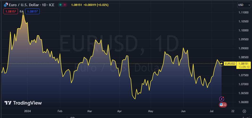
The area chart is a time-based chart that & is basically a line chart with a shaded interior. The essence of the color shading on area charts is so that when comparing two different currency pairs, you can visually see the areas of convergence.
Pros & Cons of Area Charts
👍 Pros
- Good for comparing different currency pairs
- Easy to detect chart patterns & trends
- Visually appealing
👎 Cons
- Too little information on price action
- Takes up screen space
Tick Chart – Best Chart for Trading Futures
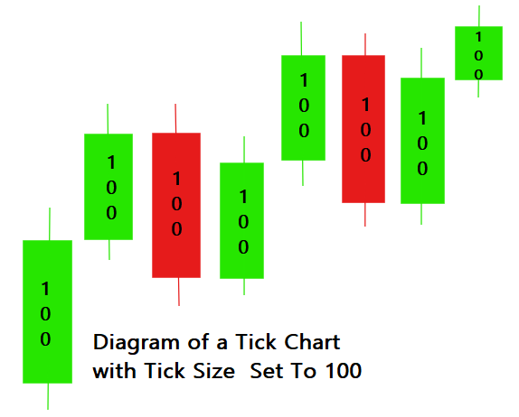
The bars on a tick chart don’t form based on time intervals, instead they form when a certain number of trades are completed.
Unlike a candlestick chart where candles must form at given time intervals, bars form on a tick chart only when a specific condition is met & this eliminates noise on tick charts giving a cleaner screen.
For example, if you set your tick volume to 100 ticks, then after every 100 transactions a new bar is formed on the tick chart.
The bars on a tick chart are just like candlestick charts and they also show you OHLC price information.
With tick charts, the highest & lowest prices reached for each bar are smaller so when placing a stop loss, you end up with a tighter stop loss & better risk to reward ratio.
However, if your trading strategy depends on high volume, tick charts may not be ideal because when volume is low the bars don’t form quickly.
Pros & cons
👍 Pros
- Less choppy charts because bars only form when a specified number of trades take place.
- Entry/exit points when detected are usually more accurate than with other chart types
- It is easier to see the overall market trend on tick charts because most of the noise has been compressed
- Tick charts help you place a tighter stop loss
- Tick charts are very customizable & flexible
👎 Cons
- You never know when the next bar is going to form
- Tick data may need to be purchased
- Tick charts are not popular & are not available on many trading platforms
Renko Charts – Best for Spotting Long-term Trends
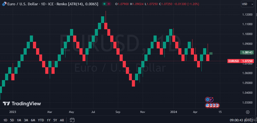
A Renko chart is not based on time, instead it’s based on volatility. Each block represents a price movement by a certain number of pips from the closing price of the previous block.
If you select a 5-pip size for each block, then a new block will form after price changes by 5 pips from the closing price of the last block.
The green blocks show rising prices with the bottom being the open price and the top being the closing price.
The red blocks represent falling prices with the top of the block showing the opening price & the bottom showing the closing price.
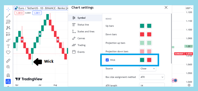
What do Renko Wicks mean? From the settings you can choose to display Renko Charts with wicks which show the highest & lowest price attained before closing.
How do I set the size of Renko Blocks? To set the number of pips you want each Renko Block to show, you go to settings and change the box size.
Pros & cons
👍 Pros
- Fully customizable
- Visually appealing
- Eliminates noise and lets you focus on specific price action
- Renko charts do not show gaps during weekends or holidays
👎 Cons
- Not popular: Renko charts are not available on some trading platforms
- When market activity is low, the blocks will form slowly
- Doesn’t show you in-depth price action

Leave a Reply